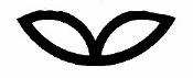
 Two leaves of Rhododendron form the base of the logo. Upon them rests
a Ginkgo biloba leaf.
Two leaves of Rhododendron form the base of the logo. Upon them rests
a Ginkgo biloba leaf.
| | Introduction | | Treatments | | eFloras | | Checklist | | Images | | Editorial Centers | | Guidelines | | Questions? | | Home | |
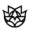
The Flora of China logo was designed by Charles Phillip Reay, an architect at Hellmuth, Obata, and Kassabaum, St. Louis. The logo finds its genesis in the joining of a group of nested leaf forms, all except that of Ginko belong to genera extant in both China and North America. The leaves express the similarities of forests that once covered both lands and symbolize the Sino-American botanical collaboration as represented by the joint production of the Flora of China.
Two leaves of Rhododendron form the base of the logo. Upon them rests
a Ginkgo biloba leaf.
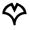 The curve of the Ginkgo leaf is reflected
in its counter, a line which describes the upper of the three lobes of the leaf
of the Chinese sweet gum, Liquidambar acalycina.
The curve of the Ginkgo leaf is reflected
in its counter, a line which describes the upper of the three lobes of the leaf
of the Chinese sweet gum, Liquidambar acalycina.
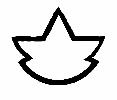
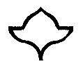 The leaf of the Chinese sweet gum
is completed by the horizontal lines reaching outward to the edge of the
logo and by the curved half circle of the base.
The leaf of the Chinese sweet gum
is completed by the horizontal lines reaching outward to the edge of the
logo and by the curved half circle of the base.
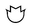 The leaf of the tulip tree,
Liriodendron forms the outer line of the logo.
The leaf of the tulip tree,
Liriodendron forms the outer line of the logo.
 The leaf of the American
sweet gum, Liquidambar styraciflua rests within the others. Its upper
lobe is formed in the inverted V-shape that rests on the Ginkgo leaf. Its
two middle lobes are drawn by the horizontal line and the two inward-moving
curved lines. Its lower lobes are coincident with a part of the lines
describing the Rhododendron leaf.
The leaf of the American
sweet gum, Liquidambar styraciflua rests within the others. Its upper
lobe is formed in the inverted V-shape that rests on the Ginkgo leaf. Its
two middle lobes are drawn by the horizontal line and the two inward-moving
curved lines. Its lower lobes are coincident with a part of the lines
describing the Rhododendron leaf.
"The leaves go from those which are simple to those of increasing complexity. This progression (one, two, three, four, five ...) suggests the growth and expansion of knowledge in systematic botany. In the complexity of the form there is truth: the deeper we look ... the more we will find." - C. P. Reay.
 Back to Flora of China Home Page